.png)
VELA
iOS mobile application
THE PROBLEM
Water sports aficionados need a dependable way to access and understand complicated wind, wave, and weather reports and forecasts because they wish to stay safe on the water and want help in determining their water activities.
MY PROPOSAL
Vela will allow access to dependable and clear data. The interface will be designed simply, but in a pleasing and beautiful way to allow users to focus on gathering information quickly and staying safe.
TIMELINE
January - August 2021
ROLE
UX Researcher
UX/UI Designer
TOOLS
Balsamiq
Figma
Google Forms
OptimalSort
Usability Hub

MAGICSEAWEED

STRENGTHS
-
Huge community of followers to encourage user connection
-
One of the oldest sources of long-range surf forecasts
WEAKNESSES
-
Geared only to surfers.
-
Room for improvement in customizable features
WINDY.APP
STRENGTHS
-
Forecasts based on NOAA weather monitoring data
-
Very detailed forecasts geared toward professionals
WEAKNESSES
-
Very complicated layout
-
Usability is weak and navigation is unclear
UNDERSTANDING THE USER
User Surveys and Initial Interviews were performed to better understand what users may want and need from an app like Vela, and to make sure that all functionality of the app is focused and logical. The below collected data was used to define the audience and create User Stories and Personas.
GOALS & STATS


SURVEY FINDINGS

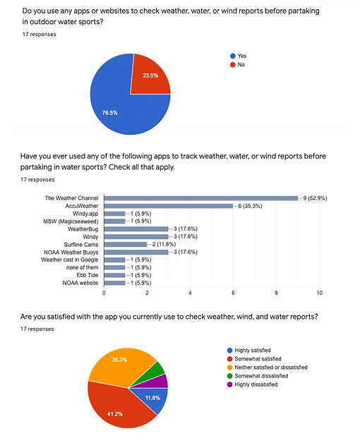
KEY INSIGHTS
-
75% of participants check wind, water, and weather reports before going on the water.
-
Users care most about accuracy of information and ease of use. Users check reports for safety, reassurance, and comfort.
-
Common frustrations with existing apps – layout of pages, inconsistent data, finding the information that’s needed, and missing information.
-
Even amateurs want to see a detailed page of reports.
-
Being able to set customizations in an app for users’ preferred sport would be ideal.
-
Ideal features would include reports for water temperature, currents, direction of wind, water level, and wave reports for most average users.

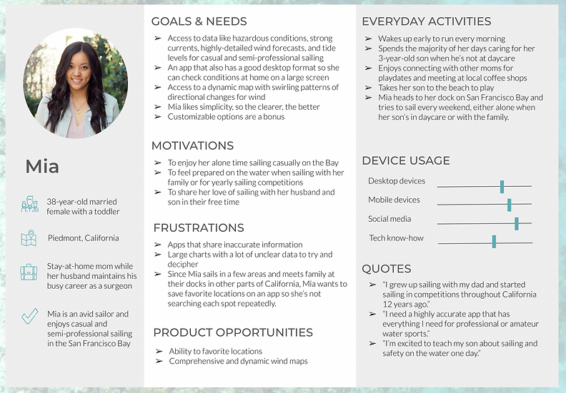
USER PERSONAS

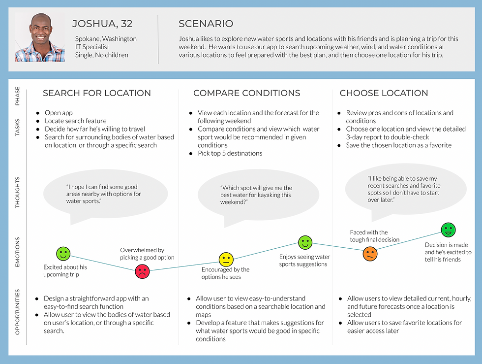
JOURNEY MAP
TASK ANALYSIS

OPEN CARD SORTING
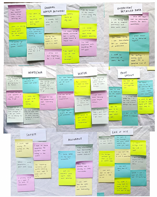
After conducting an open card sort through OptimalSort with 7 participants [ages 25-60; amateur sailors, swimmers, divers], I was able to deduce a few key takeaways to assist with the design process.
The sitemap was then revised based on my research and feedback. Changes include adding the Onboarding, Signup, and Preferences screens; renaming Profile to Account; adding Alerts to the Homepage; making Search a standalone category; adding Settings to the Account section; adding My Locations and News pages; and removing unnecessary subcategories.

INITIAL SKETCHES
Sketches were made to flesh out a few key tasks.
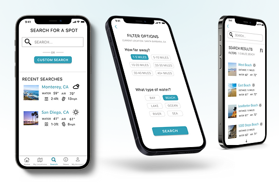
SEARCH


DETAILED DATA
ITERATION
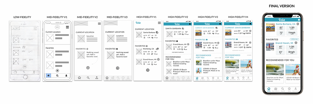
Mid-Fidelity and High-Fidelity Wireframes were developed, followed by a Clickable Prototype.
Hypotheses were tested during Usability Testing and designs were re-iterated.
The updated prototype was tested again during A/B Preference Testing and designs were updated to reflect feedback.
ONBOARDING

LOCATION SEARCH

HOMEPAGE

SEARCH BY FILTER

USABILITY TESTING
A Test Plan was established to test the prototype with 6 participants in the form of Moderated Remote and In-Person Usability Tests. Each participant was given 4 tasks with the current prototype at this stage. Success was measured through a Single Ease Question for each task. A Test Report outlines major issues.
Results were recorded with Affinity Mapping, and a Rainbow Spreadsheet.
For the complete Test Plan and Test Report; a complete list of errors, observations, and quotes; plus Affinity Mapping, please click below.

FEEDBACK REVISIONS
ISSUE
SEVERITY: HIGH
Clicked on "Sign in” and not “Sign up"
Clicked "Sign in with Google/social"
EVIDENCE
4 out of 6 participants selected the wrong option
SOLUTIONS
-
Make text larger and more obvious
-
Add "Sign Up" button to all screens
-
Or Add "First time user? Click here!”
ISSUE
SEVERITY: HIGH
Lack of text labels on sports, hourly air details, data in overview section, sign up details
EVIDENCE
3 out of 6 participants had issues and had questioned about the data.

SOLUTIONS
-
Add more text to onboarding sports
-
Add labels to hourly air data
-
Add labels to overview page
-
Add labels to sign up fields


A/B PREFERENCE
TESTING #1
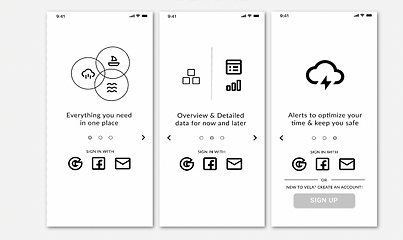
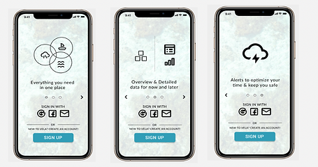
Multiple users experienced issues during usability testing when instructed to sign up. I reformatted the Intro screens to lead the user more clearly to either Sign In or Sign Up.
UsabilityHub was used to test two versions of the Introduction screen with 10 participants. A clear winner was chosen for a few reasons. Mainly, users liked having the choice to sign up without scrolling through onboarding, and appreciated the simple “create a free account” text.
A/B PREFERENCE
TESTING #2
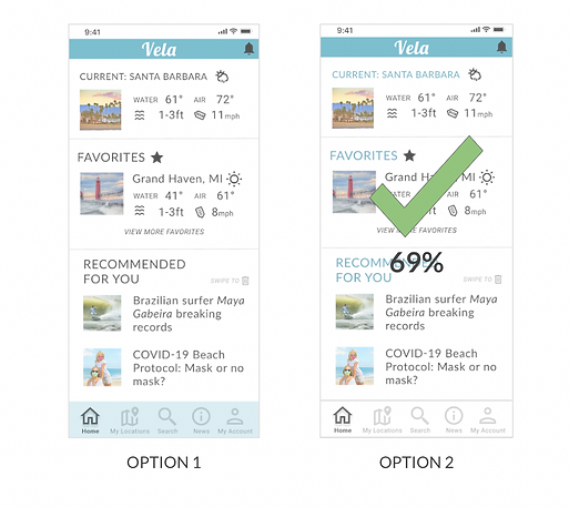
Participants badly wanted colors to navigate through pages. Colors were added to help users see the definition of sections and hierarchy, plus understand where to click.
UsabilityHub was used to test two versions of color use with 13 participants. Participants preferred Option 2 because of the cleaner and simpler design. Brand colors were present in both designs, but users preferred the light bottom navigation tab so that text was clearer and that icons stand out more.
FINAL TOUCHES
Designs were refined again based on iOS mobile guidelines, accessibility, and best practices for visual design standards. The prototype was iterated upon again following design collaboration with peers and my mentor.
Deliverables were gathered to mimic developer handoff, including design documentation and exporting of assets.
HOMEPAGE ITERATIONS
CLICKABLE PROTOTYPE
Please use the interactive prototype to learn more about Vela. If you get lost, just look for the blue hotspots which show you where to click.

LESSONS LEARNED
Upon gathering all iterations, most screens went through 5-10 different versions throughout the iterative design process. Changes were based on mentor and tutor feedback, general user research, business requirements, card sorting results, feedback after user testing, visual design principles, peer review, and best practices for accessibility.
-
Designs shifted over time to be simpler and cleaner.
-
Hierarchy and alignments are correctly displayed and users should feel familiar with many common and expected features such as Onboarding preferences, Search, Filters, and data visualization.
-
Elements, such as buttons, are uniform and consistent throughout, and the app features the brand color over a simple black & white color scheme.
While working on Vela, I learned about the importance of iterating based on usability and preference testing. I look forward to applying these skills to future iterations and projects.